Feature Friday - Food Photography & Styling Tips from The Gathering Table

The first Friday of every month will be Feature Friday. Mommatography will showcase photographers, artists, and fellow bloggers to share their unique talents and skills. This week's post comes from a friend and food photographer Sheena Bates. Check out her blog and follow The Gathering Table. If you are a food blogger, or want to improve your food photography, today's post is full of great styling and composition tips. 


Hi! I’m Sheena Bates from The Gathering Table. I’m super excited to be here and share some tips on food photography. Just to give you a little background on myself, I’m originally from Utah and attended Utah Valley University  where I got my BFA in photography. That is where I discovered food photography and how much I love it. I now live in London with my husband and two year old son. My husband is a photographer as well. I’ve done a few commercial shoots for various restaurants and catering companies both in Utah and in London. I started the Gathering Table when I was in school and have been on and off with blogging till now, when I’ve decided to really get into it. I love that it allows me to follow my passion, while still being at home with my son.

Food photography is awesome! In my humble opinion, it is truly the best genre of photography, because it’s something that we can all relate to. After all, we all eat, right? And who doesn’t have a memory that is tied so closely with food, that seeing a lovely, composed shot of something delicious will take you right back? That is why I love shooting food. That and you don’t have to try to coax little ones to smile naturally. 

Food Photography Styling Tips - Sheena Bates - The Gathering Table

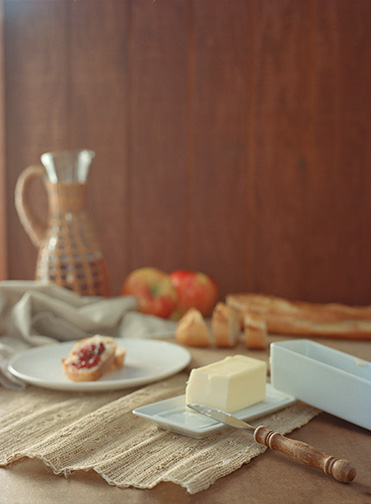
On to the good stuff! Let’s talk styling. There is no one way to style a dish. I typically like to think about what it is that I’m styling. What images come to mind when I think of that food. Let’s take soup for example: soup is (usually) warm; something you have at home, a comfort food. So I may go more rustic with my styling, playing with warm tones, worn or as I like to think of it, loved props. Fish, on the other hand, has to be fresh, can be warm or cold, and typically has a lighter, lower calorie connotation. So I would use lots of greens in my styling, fresh herbs and go for a lighter, airier look. The styling and the lighting of your image is really what will create the mood for your food photos. 

After deciding upon my mood, I gather props. Here you can go very busy, or simple. Like Alise mentioned in the intro post to food photography, charity shops (thrift stores) are a great place to look for props. Scraps of fabric, napkins, ingredients that are in the dish, and other dishes such as glasses, utensils all make great props to style your photo.
Food Photography Styling Tips - Sheena Bates - The Gathering Table

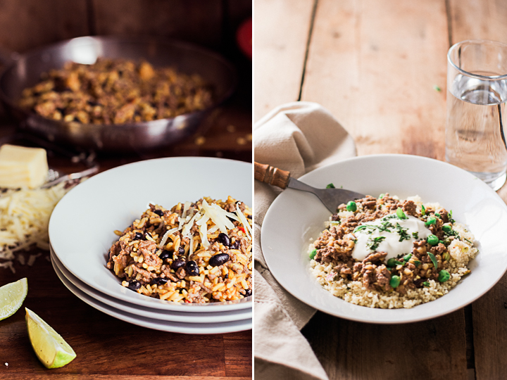
 [rice and beans: iso 800 f/3.5 1/100 sec] [couscous with lamb and peas: iso 800 f/2.8  1/500 sec]

For the rice and beans photo I included a lot of props (there were more on the other side of the dish). To tell more of a story, you can use the ingredients that are in the dish to help style your photo. It is also helpful to use a pan or pot that the dish may have been cooked in (I usually don’t use the actually pot or pan that it was cooked in, but will transfer it to a clean one, so there aren’t any spills—unless that looks add to the look and story I’m going for—see what I mean about no one way to style?). The image on the right, the couscous, lamb and peas, has a much more simple approach. There are really only three things in the photo: the napkin, the dish and the water. It still works though because of the garnishes: the yoghurt and the herbs. Can you imagine if it was just couscous and lamb? Wouldn’t look very appetizing! 

I love to try to tell a story when I style. I think about what would really be on the table or counter if someone were making the dish. Another way to do this would be shooting the different steps in recipe, but in an artful way.  

Food Photography Styling Tips - Sheena Bates - The Gathering Table

[thumbprint cookies: iso 800 35 mm f 4.5 1/640 sec] [chocolate cookies: iso 1600 50 mm f/3.5 1/125 sec]

The image on the left, the thumbprint cookies, tells a story about packaging food gifts for neighbors at Christmas time. Of course, no one would have a scene exactly like this, but it tells the story. The chocolate cookies, on right, tells about the baking process, while showing the final result. 

Food Photography Styling Tips - Sheena Bates - The Gathering Table

[rolling dough: iso 400 50 mm f/2.2 1/500] [cutting dough, left: iso 400 50 mm f/2.2 1/250] [cutting dough, right: iso 400 50 mm f/2.2 1/250]

These set of images show the process of rolling out the cookie dough and cutting it out, but it’s not your typical step by step photo. Think outside the box a little. 

Let’s talk composition. Don’t be afraid to cut off part of the dish. There is no rule that you have to include the whole thing. Think about the rule of thirds, but don’t feel married to it. It’s helpful when shooting to try many different angles. Get overhead, get it at 45º, and everything in between. 

Food Photography Styling Tips - Sheena Bates - The Gathering Table

This diptych is the exact same setting. Nothing has moved but the camera (the lens changed too). But they’re very different! And you can see, the one on the right I cut part of the bowl of soup off, while the left has most of the scene. 

Food Photography Styling Tips - Sheena Bates - The Gathering Table

[veg soup left: iso 800 50 mm f/2.8 1/100 sec] [veg soup right: iso 800 50 mm f/2.8 1/100 sec]

These images of the vegetable soup show just how different an image can look because of your angle. The one on the left, you catch the reflection at the lower angle, while the one on the right you catch the beautiful colours of the soup. That reflection can give your image a completely different feel. 

Another fun way to compose your images is to play with line. This can make for incredibly simple styled images, but that are still very interesting and catching. 

Food Photography Styling Tips - Sheena Bates - The Gathering Table

[clementines: iso 200 50 mm f/2.8 1/125 sec]

This shot of the clementines plays with diagonal line. There is actually very little going on in the photo. Because of the dynamic diagonal line created by the placement of the fruit, it works and it interesting.

using line 2.jpg

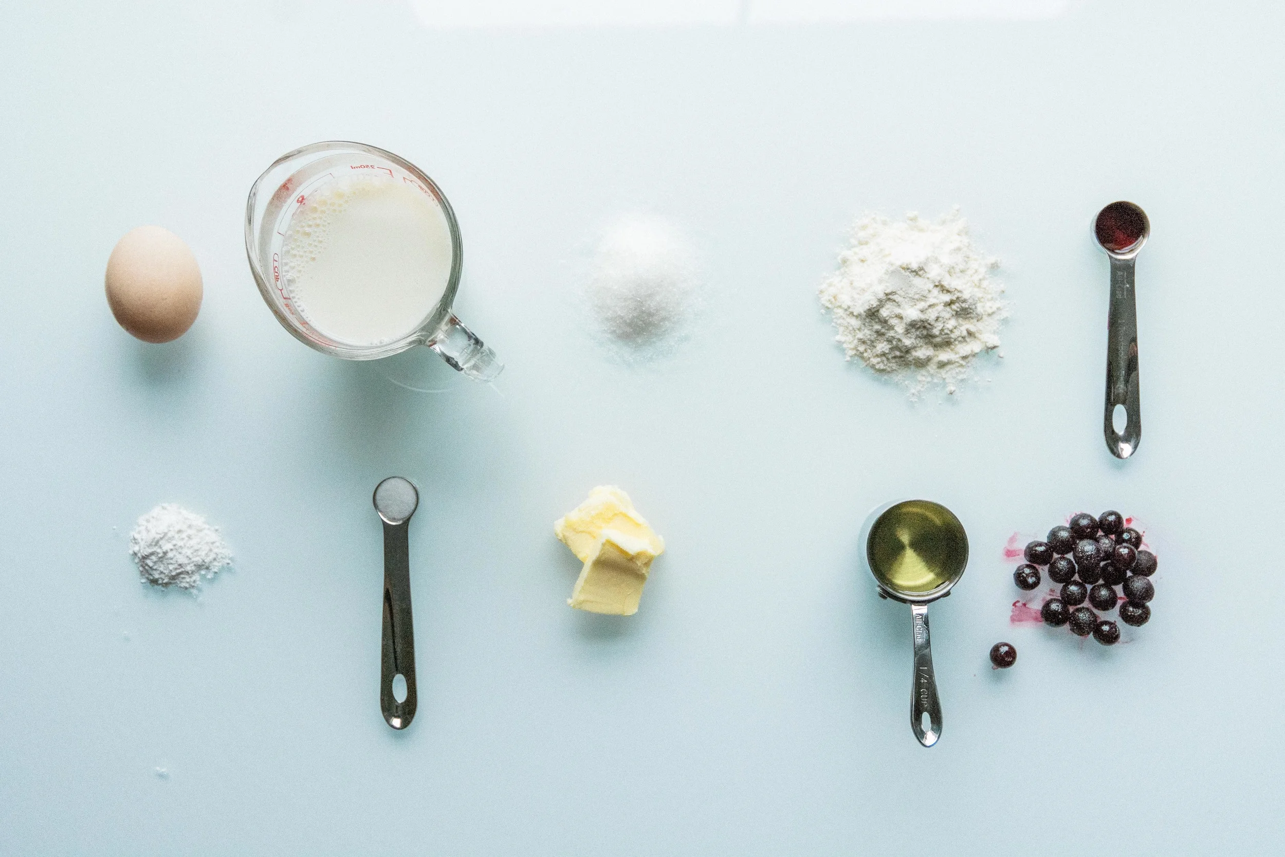
[muffin ingredients: iso 1600 24mm f/4.0 1/100 sec]

This shot of the muffin ingredients uses line, or a grid format to add interest to what would be a boring photo of ingredients. 

I hope this was helpful with your food photography. I’d love to hear from you and see your progress. Feel free to drop me a line sheena@sheenabates.com and be sure to head over to The Gathering Table and follow my posts. You can also find me on instagram: @gatheringtable. Hope to see you there.